Let's talk about color— it's one of the most powerful tools in interior design, yet it's often the most intimidating. I remember when I first started decorating my home; I was terrified of choosing the wrong colors. I stuck to safe neutrals for months, until I finally summoned the courage to add a pop of color to my living room. That one change completely transformed the space, and I've been hooked on color ever since.
Over the years, I've learned a thing or two about color matching and how to choose the right colors for different rooms. Today, I'm sharing my best tips to help you navigate the wonderful world of color.
Start with a Color Wheel
The color wheel is your best friend when it comes to color matching. It shows you how colors relate to each other and can help you create harmonious color schemes. There are a few basic color schemes that always work:
- Complementary colors: These are colors that are opposite each other on the color wheel, like blue and orange or red and green. They create a bold, vibrant look.
- Analogous colors: These are colors that are next to each other on the color wheel, like blue, blue-green, and green. They create a calm, cohesive look.
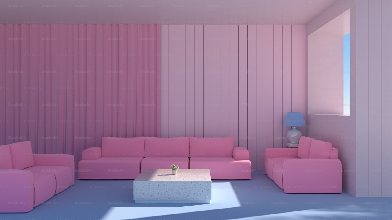
- Monochromatic colors: This is using different shades and tints of the same color. It creates a sophisticated, unified look.
Consider the Room's Function
The function of the room should influence your color choices. For example, in a bedroom, you might want to use calming colors like blues and greens that promote relaxation. In a kitchen or dining room, you might want to use energizing colors like yellows and oranges that stimulate appetite.
I painted my bedroom a soft, muted blue— it's perfect for winding down at the end of the day. My kitchen, on the other hand, is a bright, cheerful yellow— it makes me happy every time I walk in!
Think About Natural Light
Natural light can significantly affect how colors look in a room. A color that looks great in a bright, sunny room might look completely different in a dark, poorly lit space. I always suggest testing paint swatches at different times of day to see how the light affects the color.
Colors also look different under different types of artificial light. Warm white light can make colors look more yellow, while cool white light can make them look more blue. Keep this in mind when choosing your lighting!
Use Neutrals as a Base
If you're still feeling intimidated by color, start with a neutral base. Whites, beiges, and grays are incredibly versatile and allow you to add pops of color with accessories, like throw pillows, rugs, and artwork. This is a great way to experiment with color without committing to painting an entire room.
I have a neutral sofa in my living room, which allows me to change up my accent colors every season. It's a simple, affordable way to keep my home feeling fresh and stylish!
Color matching is about more than just picking pretty colors— it's about understanding how they work together and how they affect the feel of a space. By focusing on basic color schemes, room function, and light, you can create a home that feels beautiful, cohesive, and uniquely yours. Happy coloring!