Color is the most immediate way to change the mood of a room. But with thousands of shades to choose from, it can be overwhelming. The trick is to understand the feeling you want to evoke in each space and use a cohesive palette to tie the whole home together. Let's break down how to choose the right colors for your home.
The Psychology of Color
Think about how you want to feel in a room. Blues and greens are calming and perfect for bedrooms or bathrooms. Yellows and oranges are energetic and work well in kitchens or dining areas. Neutrals like greys and beiges provide a timeless, sophisticated backdrop for any space.
The 60-30-10 Rule
To create a balanced look, use the 60-30-10 rule: 60% of the room should be a dominant color (usually the walls), 30% a secondary color (upholstery or rugs), and 10% an accent color (pillows, art, and decor). This ensures that the colors complement each other without competing for attention.
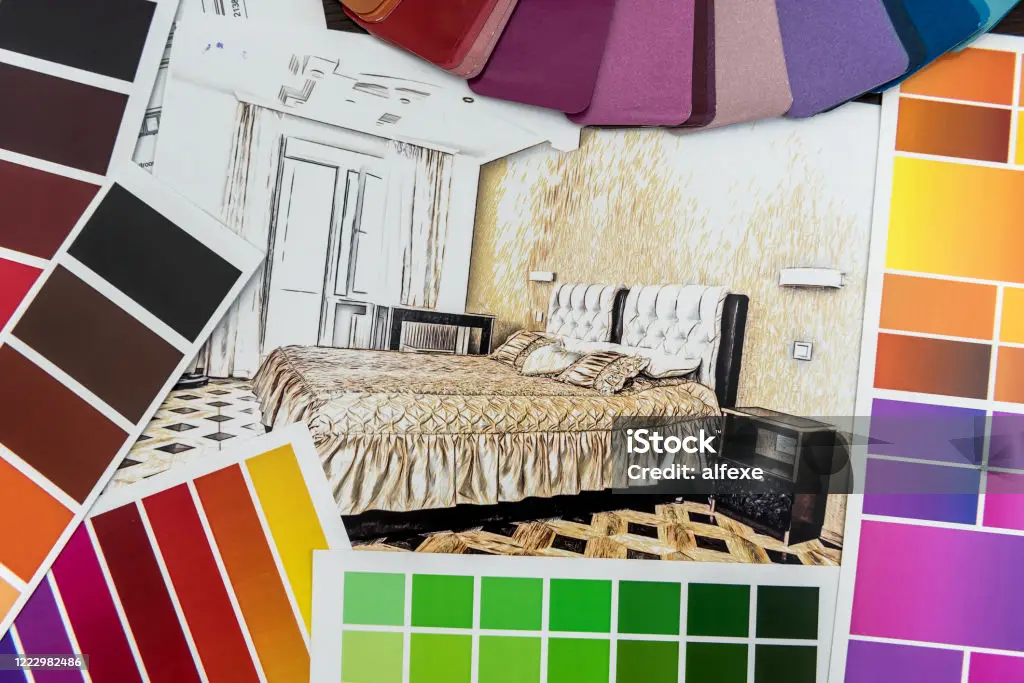
Test Your Samples
Never pick a color from a small swatch in the store. Paint a large sample on the wall and observe it at different times of the day. Natural light can dramatically change how a color looks—a soft grey might look blue in the morning and green in the afternoon. Make sure you love it in all lighting conditions.