Color is one of the most powerful tools in interior design—it can set the mood, make a space feel larger or smaller, and even affect your emotions. I've been studying color psychology for years, and I've learned how to create harmonious color schemes that make spaces feel balanced and inviting. Let's dive into some color tips that might help you transform your home.
First things first: start with a base color. This is the color that will dominate your space—usually on the walls, floors, or large furniture. Neutral colors like white, beige, gray, or taupe are popular base colors because they're versatile and allow you to add pops of color with accessories.
Understand the Color Wheel
The color wheel is your best friend when creating color schemes. Complementary colors are opposite each other on the wheel (like blue and orange) and create a bold, vibrant look. Analogous colors are next to each other (like blue, blue-green, and green) and create a calm, cohesive look. Triadic colors are evenly spaced around the wheel (like red, yellow, and blue) and create a balanced, energetic look.
Consider the Mood You Want to Create
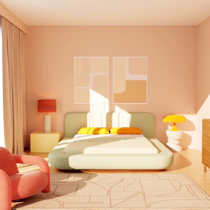
Colors have psychological effects: blue is calming, red is energizing, green is refreshing, and yellow is cheerful. Think about the mood you want to create in each room. For a bedroom, you might want calming blues or soft greens. For a kitchen, you might want energizing yellows or warm oranges.
Use the 60-30-10 Rule
This is a classic design rule that helps create balanced color schemes: 60% base color, 30% secondary color, and 10% accent color. For example, in a living room, you might have 60% beige walls and sofa, 30% blue curtains and armchairs, and 10% yellow throw pillows and artwork. This creates a balanced, harmonious look.
Test Colors Before Committing
Always test paint colors on a small section of wall before painting the entire room. Colors look different in different lighting and at different times of day. I always suggest painting a small swatch and looking at it for a few days before making a final decision. Trust me, it's worth the extra effort!
Creating a harmonious color scheme is about more than just picking pretty colors—it's about understanding how they work together and how they affect the feel of a space. By focusing on balance, mood, and testing, you can create a home that feels beautiful, cohesive, and uniquely yours. Happy coloring!